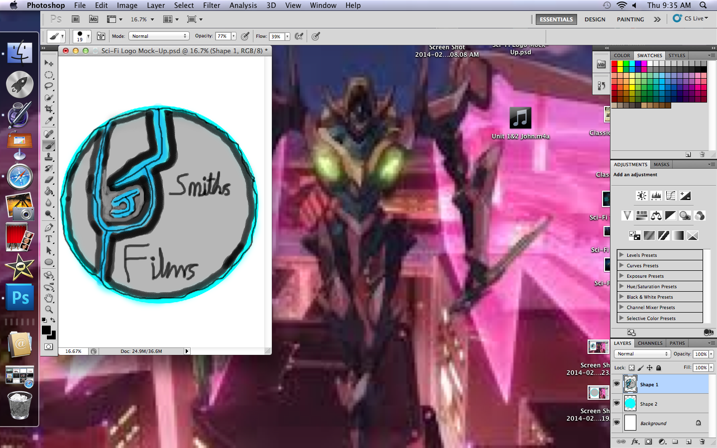
I started by using shapes because it is quicker than tracing a circle twice and just as accurately, the colours were well contrasting to each other and I could not let bad tracing ruin its look.

I made the J and outlined it as carefully as I could, the smaller J is harder to outline. I added extra detail as i went along, such as the thin line in the centers of each out line and the J's.

I added the two text layers with ease and went about putting in the 'smith's films' to complete the logo, below the current image is the finished result.


No comments:
Post a Comment