Thursday, 6 March 2014

Evaluation for Project.

My idea generation was a bit harder as company names are difficult to think of, using my own name took a while but I managed to create a name "JJ Smith's Films". The logo was harder to create but with help from ma'am, It was done on time.

Sketching out was annoying as the design had to attract the attention of any audience, we had multiple designs such as Sci-Fi, Hippie, Light and Dark. I chose Sci-Fi as it was easier to create using only 3 or so colours.

Mock-up design was fairly easier than I thought as I now have better experience in using photoshop due to previous units. I used Layers to add text, Design and shapes for the base shape which was a circular design. I used colours that contrasted well to attract the audience.

Studio and location photography was a bit hard, as one person needed to angle the light and the other to arrange the trainers to contrast the light to our specifications. We practiced this for when we may need to take photos for our shoe/trainer advertising using photo editing software. Styles included Dark, Shady, Light and Stagelight.

I used Photoshop to create my poster/logo and used shapes, pencil and painting tools to add colour to it, I added layers for each individual shape and text which helped to keep it together.

My Strengths are…

Sketching out design layouts using different colours that contrast well together.

Studio and location photography because I knew some different styles and knew that I could use them.

My Weaknesses are…

Studio and location photography for when I had to constantly remember the light settings for each individual style of lighting. This could be overcome by remembering the settings and planning better

My design is suitable for my target audience (teens and adults) because it has a Modern Sci-Fi touch to it, using cartoons would not contribute towards this as children are not part of the target audience.

My design responded correctly to the brief because it was clear, bold and communicated the information across with no problems.

My Logo was interesting and it hooked the buyer/watcher with its simple, sleek design that said that it is a film media company and will deliver good service.

It is sci-fi action looking, which is what the majority of movies and films are these days, this allows a link in with the public, allowing them to understand that this is the kind of films we can produce.

It clearly says, JJ Smith's FILMS. This bold text allows just a quick glance for anyone to know what this company is for.



Thursday, 27 February 2014

Evaluation for Final Logo Piece

I used Photoshop to create the logo from scratch as it is much easier than using Illustrator.                                                                                                    

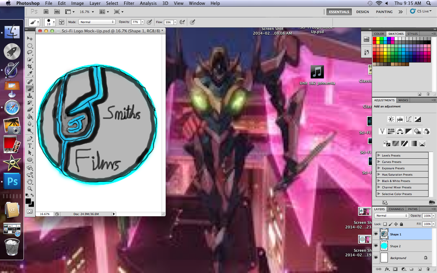
I started by using shapes because it is quicker than tracing a circle twice and just as accurately, the colours were well contrasting to each other and I could not let bad tracing ruin its look.


I made the J and outlined it as carefully as I could, the smaller J is harder to outline. I added extra detail as i went along, such as the thin line in the centers of each out line and the J's.


I added the two text layers with ease and went about putting in the 'smith's films' to complete the logo, below the current image is the finished result.


My Final digital design for my company's logo


Thursday, 6 February 2014

Website/Logo Themes.


All designs were based on the following themes:

Classical, gold, silver and black.

Sci-Fi, futuristic, new-age, blue, silver and black.

Hippie, colourful, out-there with multiple colours and bright swirls.

Dark, Black, grey and silver with sinister spiked curls and borders

----------------------------------------------------------------------------------------------------------------------------------

I have chosen Sci-Fi, because it is a well known theme and is suitable to the logo design scheme. The colours contrast it well, and it is fitting for the 21st Century.

Thursday, 30 January 2014

Review and Analysis of Final Logo Design and Company Identity

Final Logo:

One of many things that inspired me was the circular, wavy design of the Pepsi logo. Reason being that it looked like it drew people in at night or day.


Companies that use their names as a company brand name are very inspiring, people such as Walt Disney. This helped me to use my name to name the company.


What inspired the colours of yellow+black+purple was that for one, yellow and purple are opposites on the colour wheel, which allows them to contrast each other well, and black because it is a modern colour, and seemingly fits in with any colour.


I made my company a FILM product company because I was inspired by HAT films, as their random nature and connection with the public allowed me to gain an insight into how it all works and what I could do with my own film company to make it better.

Thursday, 23 January 2014

Film Logo Design Idea's


I made some design Idea's for the Film Company Logo and copied them into my book.

I used Black, yellow and purple for my main colours as purple and yellow are opposites on the colour wheel they allow each other to stand out. Additionally they also allow more contrast into the logo design.

I would need to use Photoshop to allow the yellow to stand through and to enable a darker purple + black combination.

In my opinion I would prefer to use 5 as its design is unique compared to other companies that are currently out in the film making business.

Services.

Considering that it is a film company, some of my services will include:

  • Animation.
  • Film.
  • Updates.
  • Advertisement.
  • Game Design.
  • Interviews.
I am covering these services because they are some of the more needed updates in society and most people would be interested in seeing whats going on.


The game service allows the company to connect with the more youthful viewers of the companies websites and media. Games cover much of the media, almost as much as films! Gaming is like drama, it brings us together, it tears us apart, but when it comes to you… we'll just cross that second part out.
If you need info, we have it. If you need offers, we have it. So… long story short, come to us!


Animation is a much respected part of film industry as it provides the laughs, joys and wonder that films are getting more and more of these days. With animation, nothing is impossible and nothing is unexpected or unsurprising.


Updates are a major part in - well, keeping people updated!
It's not very nice when you don't know what's going on in the world while you are stuck indoors with nothing but a mug of tea and an electronic device on your lap, so this service should be able to stop those annoying rainy days indoors.


Film is the main reason this company is existent, film plays a HUGE part in media and is remembered  throughout the ages! Without film, this would be a very boring world indeed, and I don't think thats very acceptable when it comes to the fact that entertaining yourself just doesn't work out.


Advertisements… here it comes, it was inevitable. Adverts, those annoying things you have to put up with when in-between your favorite shows on T.V. You watch one and you feel like you've seen them all. But we offer something a bit… well, a bit different. Our adverts VISUALLY HOOK you into them via their bright colours and designs, but even though the adverts are good, some people don't wont that all over their browser when it comes to viewing th website so we made an individual tab where we put them for you to look at later.


Interviews and Interrogation. Believe me, there IS a difference! Interviews are the voice of celebrities, game artists, production companies; generally they are the people behind the company big men.
They supply the world with all your favorite music, films, games (and for some people, adverts!) and much more. Interviews with us and other companies have a line drawn across merely because ours do not involve a heat lamp and rope. You want answers? Here they are, we won't mind some celebrity info now and again…


Thursday, 16 January 2014

Mind Map


I have decided on JJ SmithsFilms because the logo design matched the kind of branding. It was suggested that I have it called JJSmith's' because the 's' added a catchier tone to it.