Thursday, 19 December 2013
Final Poster
I think the process was harder than most programs because of the layout but to say the least, It was a good example for me of how Photoshop really works.
If I were to improve this I would need more practice on photoshop so that I could get it done faster and more effectively.
The image quality was fine, but if I were to improve this, I should focus more on the task and have a more spread out knowledge on what each individual feature does so that I can enhance it.
I think I chose a good background, the hedge, and mountains but the boot image could have been better if i chose a more revealing fuller boot with everything it has within the image border.
Thursday, 12 December 2013
Photographs for Final Piece
We used this photo as the general background because it easily blends in with the bottom of the mountain and the top of the hedge.
I took this photo of the grass outside the front of the school music block, just near the pavement.
On the right, this hedge was also taken outside the front of the music block.
We chose this because it changes the scale of how far away the mountains are.
They are also a good combination with the grass background to create a more green scape to match the environment.
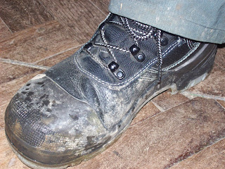
The image on the left was taken in the site workers break room near the dance studio.
We chose these boots because they were a good style and they had to be a substitute of the images I lost.
We took it from this angle because it gets the fullest of the boot to use in the final image.
These hedges are duplicates so that I could chose the correctly posed image.
These mountains too, are also duplicates along with the other images duplicates.
just like the other duplicates, they were there so that I could chose which one was better posed for the final image.
These mountains were the closest to us which was another reason as to why they were used.
Thursday, 5 December 2013
Self Assessment
1. We use studio lights because they are specialized equipment for adjusting contrast and positioning in the way that any person sees fit.
2. I used the lights as they were as the only thing i changed about them was their level of contrast and positioning so that I could create effects like the spotlight or shadows by altering their positioning (I prefer to call it Light Path).
3. Next I will need to...
a. Take a photo of any mountainside/hillside with my iPad.
b. Upload all photos to Desktop and Blogger.
c. Start designing my poster on Photoshop (Trainers)
Lighting Workshop
For this kind of lighting, I moved both of the lights to the right of the shoes to get a shadow effect, I had the brightness turned to number 3 on the both of them to make a darker more eerie effect on the shoes
In this one, I increased the lighting brightness to number 6 to induce the spotlight effect upon the trainers.
The lights were positioned left and right symmetrical to each other and both focused down on the shoes to fully employ the contrast.
For this I attempted to combine the spotlight effect and the shadow effect and was left with an amazing result.
The light positioning had the 1 light in the middle and one to the left, the left light's path slanted on the side for the shadow and the middle light's path was focused in on the shoes for the spotlight.
the light causing the spotlight had the brightness set to number 6 and the light causing the shadow had the brightness set to number 3.
This effect was a simple, plain, semi-shadowed but bright effect, which in some way resembles normal daylight.
A good way to highlight the trainers is through this simple method.
The lights were positioned in the middle, and the brightness turned to 8 on both of them.
Thursday, 21 November 2013
Examining Visual qualities of Trainer Posters.
The function of an advert is to literally broadcast the ideas of a product, its features and why it should be purchased, this can be shown with a Bold Title, colours to attract a target audience and the product itself has to be explained in a simple way; because 8/10, people will look for a moment, and just walk away.
Some of the main features of an advertisement include Informative texts, Images and design.
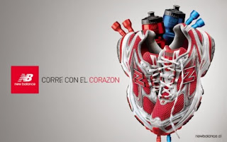
Some adverts include a storyline, like the poster to the left, the trainers are arranged to look like a heart which is sending out the message "Sport does well for your health" so why not wear the trainers? maybe a slogan using a play on words; sometimes even a theme is set around holiday periods for that extra boost of popularity.
But if there is one thing straight here, its not aimed at children because there is no bright colours, and the background is plain silver; to kids its just a logo and a pair of trainers arranged upwards, but to an adult or young adult it is plain and simple because the adult understands the simplicity of adverts.
The only visual elements to attract the audience are the logo, the slogan and of course the trainers and what they are representing. No bright colours, no information, no other imagery. They have most likely used Photoshop to create this poster because of its popularity in business and that it is the ultimate tool in manipulation of photography, due to Illustrator's balance between writing and a complicated layer system for photos.
Also its because trainers cant hover in mid air, so photoshop can place the images there and all the sports equipment around the trainers are layered individually to look like a heart.
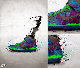
These graffiti casual trainers look more colourfull so it is for a younger audience, for people who want to draw a lot of attention to themselves.
This is aimed mainly at self-conscious minority of teens an children who want to look different that everybody else or just want to show off to their friends. The advert shows distorted colour exploding from the trainers, colours of black, green, blue and purple these colours are popular with teens who spend their times in the streets or in gangs.
The advert also shows the background as plain silver as well, except this time it makes the trainer stand out so at a moments glance, they know as much as they need to. Because to be truthful, teenagers these days don't care about information, they just care about how they look and whether they are popular. For the same reasons as the last, I think this is made on Photoshop.
The advert is split into 3 screenshots to make the visual elements more pleasing and vibrant. This adds more interest into the product, leaving most customers astounded and peer-pressure is caused by brands such as this.
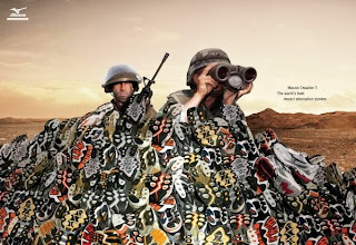 This advert is very different from the rest as it involves a storyline of war with a pair of soldiers using Mizuno trainers as sandbags instead of the barriers they were supposed to, this shows that the trainers are high impact and are very durable.
The colours in the pile on the adverts suggest they are colour variant and come in a number of unique designs. These seem to be aimed at a wide range in an audience including Teens , mostly Adults and children.
This advert seems to be set up in green screen photography software via camera and a computer. This is a fairly good choice if you want to make a more realistic un-edited Poster for the public.
For a sum up of everything, I believe that I could use the first poster's layout and message sending properties, the 2nd posters vibrant colours and the ability to stand out, and the last posters representation of different situations involving the product. These are three key points in my advertising campaign for trainers.
Some of the main features of an advertisement include Informative texts, Images and design.
Some adverts include a storyline, like the poster to the left, the trainers are arranged to look like a heart which is sending out the message "Sport does well for your health" so why not wear the trainers? maybe a slogan using a play on words; sometimes even a theme is set around holiday periods for that extra boost of popularity.
But if there is one thing straight here, its not aimed at children because there is no bright colours, and the background is plain silver; to kids its just a logo and a pair of trainers arranged upwards, but to an adult or young adult it is plain and simple because the adult understands the simplicity of adverts.
The only visual elements to attract the audience are the logo, the slogan and of course the trainers and what they are representing. No bright colours, no information, no other imagery. They have most likely used Photoshop to create this poster because of its popularity in business and that it is the ultimate tool in manipulation of photography, due to Illustrator's balance between writing and a complicated layer system for photos.
Also its because trainers cant hover in mid air, so photoshop can place the images there and all the sports equipment around the trainers are layered individually to look like a heart.

These graffiti casual trainers look more colourfull so it is for a younger audience, for people who want to draw a lot of attention to themselves.
This is aimed mainly at self-conscious minority of teens an children who want to look different that everybody else or just want to show off to their friends. The advert shows distorted colour exploding from the trainers, colours of black, green, blue and purple these colours are popular with teens who spend their times in the streets or in gangs.
The advert also shows the background as plain silver as well, except this time it makes the trainer stand out so at a moments glance, they know as much as they need to. Because to be truthful, teenagers these days don't care about information, they just care about how they look and whether they are popular. For the same reasons as the last, I think this is made on Photoshop.
The advert is split into 3 screenshots to make the visual elements more pleasing and vibrant. This adds more interest into the product, leaving most customers astounded and peer-pressure is caused by brands such as this.
 This advert is very different from the rest as it involves a storyline of war with a pair of soldiers using Mizuno trainers as sandbags instead of the barriers they were supposed to, this shows that the trainers are high impact and are very durable.
The colours in the pile on the adverts suggest they are colour variant and come in a number of unique designs. These seem to be aimed at a wide range in an audience including Teens , mostly Adults and children.
This advert seems to be set up in green screen photography software via camera and a computer. This is a fairly good choice if you want to make a more realistic un-edited Poster for the public.
For a sum up of everything, I believe that I could use the first poster's layout and message sending properties, the 2nd posters vibrant colours and the ability to stand out, and the last posters representation of different situations involving the product. These are three key points in my advertising campaign for trainers.
Thursday, 7 November 2013
Composite using Photoshop (Putting my poster in the Branding Museum)
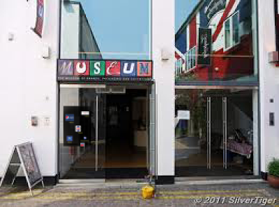
Step 1- I found a picture of a museum and found My Timeline Poster in my documents.
Step 2- I then added them both to Photoshop and dragged the Timeline over on the Museum image and also zoomed it down to size and put it over the door.
Step 3- I made sure that in the bottom left corner that the white rectangle overlapped the black one and clicked the tick at the bottom of the top toolbar.
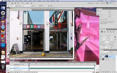
Step 4- I pressed the small circle within a rectangle button to create a Mask Layer, selected the Timeline Poster and pressed cmd+I to invert it to the Mask Layer.
Step 5- I selected the paint brush,
selected a smaller size, opacity set at
37% and then gently painted over
where the poster was to begin with
and it gradually began to show
through, thus completing the image
Step 6- Make sure during steps 2, 4
and 5 that you take screenshots to
document your work.
Step 2- I then added them both to Photoshop and dragged the Timeline over on the Museum image and also zoomed it down to size and put it over the door.
Step 3- I made sure that in the bottom left corner that the white rectangle overlapped the black one and clicked the tick at the bottom of the top toolbar.

Step 4- I pressed the small circle within a rectangle button to create a Mask Layer, selected the Timeline Poster and pressed cmd+I to invert it to the Mask Layer.
Step 5- I selected the paint brush,
selected a smaller size, opacity set at
37% and then gently painted over
where the poster was to begin with
and it gradually began to show
through, thus completing the image

Step 6- Make sure during steps 2, 4
and 5 that you take screenshots to
document your work.
Screenshots of Timeline Poster stages (Illustrator)
Step One - Open Illustrator and create a layer by clicking the small button in the layers panel in the bottom right of the screen.
Step Two - After you have made a layer, select the rectangle in the toolbar on the left side of the screen and drag it across the centre of the screen leaving space in a reasonable size for writing and uploading images.
Step Three - Click a colour of your
choice to change the rectangle and then create a new layer by repeating Step One and upload any files or images you need before doing anything else as not to dis-organize anything or make it unreadable or lost.
Step Four - Create another layer and
click the small T icon and drag a small text box across under or above your information, image, file etc. and type whatever information you need
to provide.
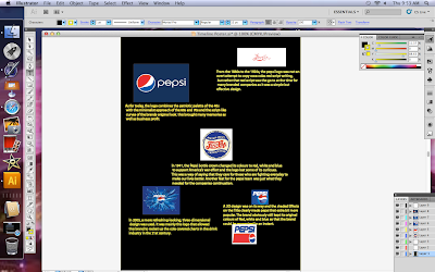
Step Five - If there is any other
information you missed out on, repeat Step One and Step Four to complete your work activity.
Thursday, 17 October 2013
The Evolution of Brands Over time.
Brand: Pepsi
From 1898 to the 1940s, Pepsi’s logo closely resembled that of Coca-Cola’s swirly red script. This may not have been an overt attempt to copy Coke’s already successful branding. Script was the go-to logo type at that time, and was used by both International Business Machines (IBM) and General Electric (GE).
In 1941, the Pepsi bottle crown changed its colours to red, white and blue to support America’s war effort and the logo lost some of its curlicues. This was a way of saying that they care for those who are fighting everyday to make our lives better. Another feat for the pepsi team was just what they needed for the companies continuation.
In 1962, another big change was made. The new design featured an image of a serrated bottle cap, which accompanied the brand’s “Pepsi Generation” campaign.
They have also made the font a nice black Bold. This allowed people to read the brand far more easier than the muddled script
Pepsi in the 1960s was the first logo of its kind to be given the red blue and white that we take for granted today. the bold black writing instead of the red made it more individual from the coke brand.
In 1973, the more minimalist design we’re familiar with today was implemented. it made things more easier to recognize among the businesses.
In 1991, the word “Pepsi” became italicized in the logo, paying homage to the original script bringing some modern inspiration into the design. the other logo that followed after incorporated a slight bit of shading into the text, changing the brands initial design was thought to increase business by an extra 15%.
A 3D design was on its way and the shaded Effects on the Title clearly made pepsi that extra bit more popular. The brand obviously still kept its original colours of Red, white and blue so that the brand could be recognized in an instant.
In 2005, a more refreshing-looking, three-dimensional design was used. It was mainly
this logo that allowed this brand to rocket up the cola covered charts in the drink industry in the 21st century.
As for today, the logo combines the patriotic palette of the 40s with the minimalist approach of the 60s and 70s and the script-like curves of the brands original look. this brought many memories as well as business profit.
The Outcome.
By using this to their advantage they have succeeded through to today as one of the best cold beverages you can buy, the evolution of a brand involves following the trends of tomorrow with absolute determination to become number one. it is products like these that demonstrate how brands operate and evolve like living beings, for example.
If something around a species/brand changes like the environment, then changes must be made so that they may stay in existence/business. It is this simple principal that allows companies to make their own choices for the future of their brands.
Thursday, 26 September 2013
Logo Research
The Adidas logo stands out because the bold colour clearly shows that it can grab someone's attention given the environment around it, and the streak lines also help to show that it is more likely to be a sports brand than any other kind of service.
However if I were to re design this logo I would strongly suggest an increase in red or blue colours or to revert back to the previous, more colourful logo to regain the sporty effect of the logo eg. The sports direct logo.
The sports direct logo sends a kind of message, sports isn't always just black and white, in my opinion it is an improvement from the Adidas logo with the plain black and white logo, which to many customers may seem just plain and boring. To attract customers, a company designing their logo needs to have plenty of colour, a simple design, the logo needs to refer to the product in a simple way, eg. If its a milk company, a cow may be a good choice and lastly it needs to have a way of sending a message to the audience that can catch the eye of the audience age group.
Finally we have the Original Xbox logo, again the colour black seems to be fairly popular when It comes to advertisement,but the colour match up of black and green seems to bring a futuristic effect upon the consumer. The colour black is chosen for many brands probably due to its easy ability to match up with other colours to create a successful advert/logo.
Anyway, back to the Xbox logo.
The logo has a few qualities that other logos have as well as the company's supplier being Microsoft. Using a sub brand to boost their own sales is an effective way to take down the market in their favour. Xbox's logo is simple yet complex as the logo looks 2d but really also has a kind of 3D effect, in my opinion, the message it sends says:
You may think we are an ordinary company, but if you take a closer look, you might be surprised at what we have in store for you...
Finally the bold XBOX sign clearly shows that they aren't here to fool around, they are here for the business they bring to you.
My conclusion is that by taking a look at the logo you should be able to find out much about the company who made it, or other companies linked to them.
Peer Assessment.
James robins
He has said all the different things about the logos like if it was him he would change the colour of the background or the writing.he has showed the the knows a lot about the logo and can
Show he can find all the things in the logo.
I agree he has met the merit criteria because of how he can find things in a logo.
Subscribe to:
Comments (Atom)


