Some of the main features of an advertisement include Informative texts, Images and design.
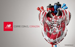
Some adverts include a storyline, like the poster to the left, the trainers are arranged to look like a heart which is sending out the message "Sport does well for your health" so why not wear the trainers? maybe a slogan using a play on words; sometimes even a theme is set around holiday periods for that extra boost of popularity.
But if there is one thing straight here, its not aimed at children because there is no bright colours, and the background is plain silver; to kids its just a logo and a pair of trainers arranged upwards, but to an adult or young adult it is plain and simple because the adult understands the simplicity of adverts.
The only visual elements to attract the audience are the logo, the slogan and of course the trainers and what they are representing. No bright colours, no information, no other imagery. They have most likely used Photoshop to create this poster because of its popularity in business and that it is the ultimate tool in manipulation of photography, due to Illustrator's balance between writing and a complicated layer system for photos.
Also its because trainers cant hover in mid air, so photoshop can place the images there and all the sports equipment around the trainers are layered individually to look like a heart.

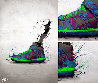
These graffiti casual trainers look more colourfull so it is for a younger audience, for people who want to draw a lot of attention to themselves.
This is aimed mainly at self-conscious minority of teens an children who want to look different that everybody else or just want to show off to their friends. The advert shows distorted colour exploding from the trainers, colours of black, green, blue and purple these colours are popular with teens who spend their times in the streets or in gangs.
The advert also shows the background as plain silver as well, except this time it makes the trainer stand out so at a moments glance, they know as much as they need to. Because to be truthful, teenagers these days don't care about information, they just care about how they look and whether they are popular. For the same reasons as the last, I think this is made on Photoshop.
The advert is split into 3 screenshots to make the visual elements more pleasing and vibrant. This adds more interest into the product, leaving most customers astounded and peer-pressure is caused by brands such as this.
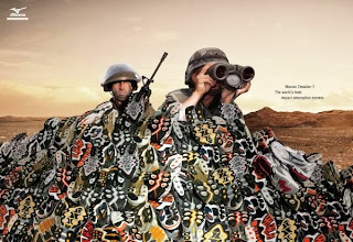
 This advert is very different from the rest as it involves a storyline of war with a pair of soldiers using Mizuno trainers as sandbags instead of the barriers they were supposed to, this shows that the trainers are high impact and are very durable.
The colours in the pile on the adverts suggest they are colour variant and come in a number of unique designs. These seem to be aimed at a wide range in an audience including Teens , mostly Adults and children.
This advert seems to be set up in green screen photography software via camera and a computer. This is a fairly good choice if you want to make a more realistic un-edited Poster for the public.
For a sum up of everything, I believe that I could use the first poster's layout and message sending properties, the 2nd posters vibrant colours and the ability to stand out, and the last posters representation of different situations involving the product. These are three key points in my advertising campaign for trainers.

No comments:
Post a Comment