Thursday, 18 September 2014

Barnardos Rebrand Poster & Notes


This is my Barnardos Children's charity poster, to campaign the rebranding of the charity.

I think this posters layout is fine because the colours contrast and are well suiting, the information is in the right places and it features a phone number and website for more information on the charity.
This poster could be placed around schools, shops, shopping centers, corporations, and even large establishments around the world, as it is a worldwide charity.

If I were to improve this poster, it would be to change the colour of the background layer, as red on red isn't a good contrast for modern charities. I would also change the colours of the circles in each corner, as a persisting theme would be nice for the posters development.


For the first part of the poster, I used a red background as i contrasts well to the other colours used for later in the poster.


Here, i have added the 4 green circles that hold information. One of the circles already hold the introduction information containing text explaining what the charity is and what they do.

I also added the charities name as a Title at the top of the poster.


Now I have typed out a small text exclaiming "Help protect the Children".


I have added a text explaining the web address to add some form of contact to the poster, for a realistic effect of course.


All information has been complete, the most recent in the bottom right corner, featuring a phone helpline number for people to report abuse.


After a bit of colour-tweaking, some rearrangement of text and adding the charity logo, fully blended into the text around it, the posters finished result was complete.

Thursday, 17 July 2014

Barnardos Rebranding Logo


This is my Rebranding Logo for the Barnardos children's charity.

I chose these colours to reflect on what the charity truly wants to achieve.

Red - This depicts the love aspect of the charity, the fact that the charity is one that loves all children no matter who they are.

Green - The natural instinct to protect the children the charity loves, it is also their primary colour and original to the old branding of the charity.

White - This represents that the charities intentions are pure and one to turn to for the corrupt and dark hearted. It is also a sign of peace and prosperity for children, as well as no bad background.

-------------------------------------------------------------------------------
As I added the colours I also strengthened the outlines so that the logo was not weakened or unnoticeable among the crowds, it needed strengthening for this purpose.

Below are stages of development for the logo's creation process.

Thursday, 19 June 2014

My rebranding for Barnardos Charity

My rebranding for Barnardos charity ideas.

The current target audience for barnardos is adults, however children need to know about the dangers they face, not just adults, changing the type of font they use in their posters may attract children so that they understand what is staring at them as a risk.

Barnardos images are a bit graphic, and not suitable for all audiences. By reducing the amount of violence in the images currently presented, children will come to understand its meaning and an increase in brighter colours such as red, blue, yellow and green will do just as good for the benefit of the children around us.

The way things are presented in their advertisements are very hard to understand for children, so maybe simplifying it will give them a chance to learn all about what Barnardos do and how they can help or go to them for advice and comforting. Barnardos needs to seem approachable, for if a child has something to report, what is the use if they are too nervous or scared to approach them?

My child abuse Poster Collage


This is my Poster collage for child abuse and parental imprisonment. It has several features showing the terrors of child prostitution, physical and mental abuse and no right to speak as shown at the bottom of the collage.

Charities - Barnado's


Barnado's is a charity that focuses around children with poor lives at home, school and have lost their chance at a future. They work to prevent parental imprisonment so that children will be free to live their lives in this world. The theme their logo is based around may be Unity, the freedom for children to be together and living their lives to the fullest.


Their poster campaigns aren't as graphic as the other charities, but they make a point. Child parental imprisonment must be stopped at all costs. It shows a child, possibly abused sexually, as it states that it "ABUSE THROUGH PROSTITUTION STEALS CHILDREN'S LIVES." This sends a clear message to any audience, mainly to adults about the consequences to child abuse.

Charities - NSPCC


The NSPCC are another Children Protection charity responsible for the sole purpose of prevention of child abuse, they don't focus too much on poverty abroad and such, but children in homes being abused are their top priority. The image above seems to send a message of safety, the colours represent that of a first aid box.


The poster campaigns they show are usually highly graphic and for some, upsetting. These images are graphic because the message they give must stick out, so it may be transferred to EVERYONE.

Charities - Save the Children


This children's charity is save the children, they are a charity dedicated to preventing child abuse and so take action against it by giving the accumulated money to organizations that prevent it.
Save the children currently work in 120 countries and counting, they have provided great aid to many countries but their most admirable work was the 2012 Child Poverty Act, where millions of children were saved from hunger and disease.


It's not only Practical work they do that inspires people, their Poster Campaigns are a major attraction to their cause and more and more donations come in as each day passes by.


Thursday, 5 June 2014

Andy Warhol Mao Piece


My Andy Warhol piece -  Chinese Dictator Mao.

Andy Warhol Research


Andy Warhol remains as one of the most iconic artists to this day.
Even after his death, his art portrayed famous icons, as was his main focus. Andy Warhol was a leading inspiration in the pop art movement for everyday people to have their own pieces of art.
a foundation was made for him in 1987, in accordance with Andy Warhol's will, its mission was to help in the advancement of the visual arts.


Andy Warhol was, to say the least a bit of a snob, he used to spend a lot of time with famous people at parties and other social and celebratory events. During the 50s, they were just coming out of the war. Everything was dull, uniforms and wreckage was plain black and white, but Andy Warhol saw past that and produced vibrant colours to portray the famous icons of the past and present. His popularity continued onwards past the 60s and revolutionised pop art today.


The term Pop Art, derived from the words popular art is exactly what it was and what it became.
In my opinion, this was a turning point in history for art, resembling and capturing the image of many a famous person, this did indeed push art not just to the rich but to everyday people and spreading its popularity and freedom to right to art.


Thursday, 15 May 2014

Hannah Hoch - Propaganda Art

Hannah Höch was born Anna Therese Johanne Höch in Gotha, Germany. 
In 1912 she began classes at the School of Applied Arts in Berlin under the guidance of glass designer Harold Bergen. She chose the curriculum glass design and graphic arts, rather than fine arts, to please her father.


In 1914, at the start of World War I, she left the school and returned home to Gotha to work with the Red Cross. In 1915 she returned to school, entering the graphics class of Emil Orlik at the National Institute of the Museum of Arts and Crafts.


Also in 1915, Höch began an influential friendship with Raoul Hausman, a member of the Berlin Dada movement. Höch's involvement with the Berlin Dadaists began in earnest in 1919. After her schooling, she worked in the handicrafts department for Ullstein Verlag (The Ullstein Press), designing dress and embroidery patterns for Die Dame (The Lady) and Die Praktische Berlinerin (The Practical Berlin Woman).


Hannah Hoch was an artist who made exceptional collages, her history as shown above is an extensive one, which led her to the collage artist she was known for.


Cause for Concern - Stencil Art


For my first Stencil, I used it on newspaper as my first background, I used grey as the background colour as it suited the dark, rebellious aura it gave off.

Black was used for the rebel, again reflecting the dark atmosphere, the molotov was yellow, red and orange which helped show off its destructive power.

A simple green for the tank attacking the rebel, showing its contrast to the rebel and molotov being thrown.


I used tracing paper as a background material this time, as shown above the background was not grey for this as I found it more relevant to focus on the stencil, rather than go through the process of covering the figures exact shapes.


For my last stencil, I used paper to make the figures of the stencils stand out more, as seen in the last two stencils,  have changed the bottle colour to black and left the flame at the top, so it is seemingly flowing out of the bottle as it is being thrown.

The background on the first seemed to interfere with much of the work, especially the fire from the tank barrel, which is why its missing from the last two.

This cause of concern stencil was for the Russia - Ukraine takeover concern, clearly showing the might of the forces by the tank, the oppression shown by the rebel, and the destruction both sides have caused by the thrown molotov incendiary.


Thursday, 24 April 2014

Cause for Concern- Russia invading Ukraine

Cause for concern - Russia and Crimea takeover.

Russia Crimea takeover is my cause for concern because this is not the first time Russia has attempted this and conflict between two countries are usually very heated topics of discussion.


The image above shows some makeshift fortifications/barricades, outside the international administration office which was seized by Pro-russian militants in Ukraine.


Image on the left shows tight security as the simple victims try to get around under normal circumstances with soldiers watching their every move, freedom isn't present in Crimea as it was before.


Image on the right portrays the destruction caused in protests and military acts in Crimea, as that is almost frequent in Russia and Ukraine, it is very likely to be just as relentless.


Image below displays Pro-Russian activists holding the Russian flags during a rally in the city centre of Donetsk on March 1st 2014. Just one of many protests to come in the future of Russia and Crimea.


Banksy Research

Banksy is a pseudonymous United Kingdom-based graffiti artist, political activist, film director, and painter.


His satirical street art and subversive epigrams combine dark humour with executed in a distinctive stencilling technique. Such artistic works of political and social commentary have been featured on streets, walls, and bridges of cities throughout the world.


Banksy's work was made up of the Bristol underground art which involved collaborations between artists and musicians. According to author and graphic designer Tristan Manco and the book Home Sweet Home, Banksy "was born in 1974 and raised in Bristol, England. The son of a photocopier technician, he trained as a butcher, but became involved in graffiti during the great Bristol aerosol boom of the late 1980s." Observers have noted that his style is similar to Blek le Rat, who began to work with stencils in 1981 in Paris. Banksy says, however, that he was inspired by 3D, a graffiti artist who later became a founding member of Massive Attack

Thursday, 3 April 2014


(above) - These were three of my ideas for my final mock up, including the topics of drink and drive, and Alcohol Abuse. Idea 1 and 3 are drink and drive, Idea 2 is Alcohol Abuse


(right) - This is my final mock up, I had chosen Idea 2 as it was more effective than the others because it makes a statement that alcohol does more damage than any handheld object, and the shock of which hits you twice as hard.

Thursday, 20 March 2014

Alcohol Awareness Analysis

Alcohol is a very important topic in Public Information Campaigns as it causes many deaths in countries across the world.

Some campaigns are displayed like the ones to the left, showing depression and other emotions caused by drinking too much.

There are many examples of adverts, such as…

 Drink and Drive, Too much alcohol kills and the Depression and mood changes alcohol can bring.


Adverts such as this are sometimes comprised of graphic images, meaning the insides and what drinking can do to you, should you have too much. These adverts prefer to hook people using the Shock method to stain the lessons learned from this in their heads, adverts like this have decreased alcoholic death by 35%.

Un-wanted Sex and Rape/Abuse caused by Alcohol.


Sometimes, Alcohol adverts can relate to Rape and unwanted sex. This is usually aimed at adults but very few at teenagers as well, as under-age sex is increasing as days go on.

there are helplines for such cases and places you can go for help with that sort of problem and they are usually shown in such posters or advertisements so that people can get the help they need with the full contact and usually a text message service.

These advertisements are increasing in number as days go on and it is preventing more sexual health problems too. They use different scenarios to make people contemplate on what alcohol can really do to your body.
Drink and Drive.
Drinking and driving are some of the more dangerous forms of alcohol abuse. It leads to more deaths than any other alcohol abuse mentioned here and puts the road in even more danger as the driver never actually knows what he is doing. Advertisements for such problems include an event and a consequence and finally, a way to prevent this. 

Ways to prevent drinking and driving include using your common sense, not drinking at late times, and having a sober person drive instead if possible. It is also important never to drink with children around as your actions could affect them badly.

As you can see, some adverts use dark humor to get their point across such as the one below.

Thursday, 13 March 2014

Peer Assessment.

L.O: Explore the different
clearly described the effects of each advertisement and poster upon the public
Morgan has clearly described the effects of each advert and poster upon the public.

Understands the times that these messages would have been broadcast.


Different types of Public Information.

Advice and Information Campaign-


The target audience for this advert is teenagers and upwards, mainly because the images and information are too graphic for younger children.

The advert is designed to shock, advise, and be informative. it also offers a way of getting out of the problem, in this case; smoking.

The video enhances the message being given by including graphic images, narrative, a typical situation and a dark atmosphere. Showing the insides and the effects that smoking has on the user is clearly displayed. It is clearly there to stick in your mind.

It would be screened in the afternoon, morning and night, as they would try to grab the attention of as many as possible to inform them of the dangers of smoking. Also, most people are at home in the afternoon and this is one of the main times for people to be watching television.


Direct messaging, Awareness Campaign-


The target audience is Older Children, Teenagers and upwards because younger children wouldn't understand the situation. All the children would see and hear are children eating, drawing and sitting. Any other age groups, especially parents with children of their own, would completely understand it.

The video enhances the message being given by showing quick images of children living under poor conditions in dusty un-tidy homes with all of them living their daily lives in somewhere that is normally inhospitable, narrated by celebrity Paul 'O' Grady to promote this message among people who know him and the public that is watching.

It would be screened/displayed all the time, as anybody and older children can be home at the day, but not as often as the afternoon. At night, most children and teenagers are in bed, and so they do not show it as often at that time.

Un-conscious messaging, Propaganda-

               
These are two very different posters that display a somewhat same message- Support the country.
These are World War 2 Propaganda posters to support the war and the men fighting in it. The audience would mainly be teenagers and adults, as children would rarely be able to support in the war.

Mind map: What is Public Information?


Thursday, 6 March 2014

Evaluation for Project.

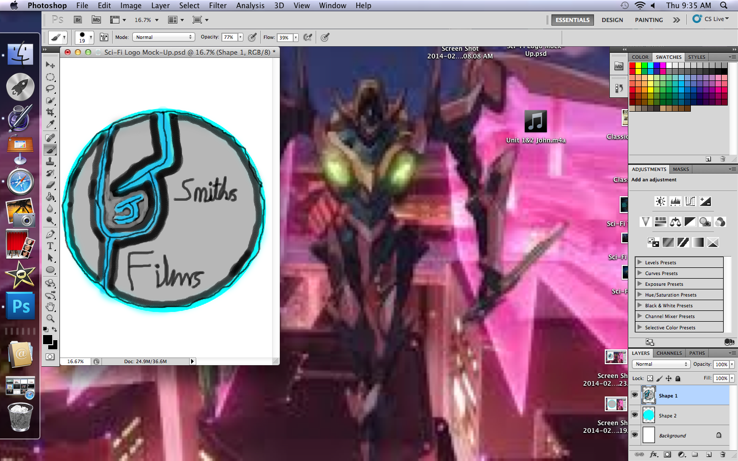
My idea generation was a bit harder as company names are difficult to think of, using my own name took a while but I managed to create a name "JJ Smith's Films". The logo was harder to create but with help from ma'am, It was done on time.

Sketching out was annoying as the design had to attract the attention of any audience, we had multiple designs such as Sci-Fi, Hippie, Light and Dark. I chose Sci-Fi as it was easier to create using only 3 or so colours.

Mock-up design was fairly easier than I thought as I now have better experience in using photoshop due to previous units. I used Layers to add text, Design and shapes for the base shape which was a circular design. I used colours that contrasted well to attract the audience.

Studio and location photography was a bit hard, as one person needed to angle the light and the other to arrange the trainers to contrast the light to our specifications. We practiced this for when we may need to take photos for our shoe/trainer advertising using photo editing software. Styles included Dark, Shady, Light and Stagelight.

I used Photoshop to create my poster/logo and used shapes, pencil and painting tools to add colour to it, I added layers for each individual shape and text which helped to keep it together.

My Strengths are…

Sketching out design layouts using different colours that contrast well together.

Studio and location photography because I knew some different styles and knew that I could use them.

My Weaknesses are…

Studio and location photography for when I had to constantly remember the light settings for each individual style of lighting. This could be overcome by remembering the settings and planning better

My design is suitable for my target audience (teens and adults) because it has a Modern Sci-Fi touch to it, using cartoons would not contribute towards this as children are not part of the target audience.

My design responded correctly to the brief because it was clear, bold and communicated the information across with no problems.

My Logo was interesting and it hooked the buyer/watcher with its simple, sleek design that said that it is a film media company and will deliver good service.

It is sci-fi action looking, which is what the majority of movies and films are these days, this allows a link in with the public, allowing them to understand that this is the kind of films we can produce.

It clearly says, JJ Smith's FILMS. This bold text allows just a quick glance for anyone to know what this company is for.


Thursday, 27 February 2014

Evaluation for Final Logo Piece

I used Photoshop to create the logo from scratch as it is much easier than using Illustrator.                                                                                                    

I started by using shapes because it is quicker than tracing a circle twice and just as accurately, the colours were well contrasting to each other and I could not let bad tracing ruin its look.


I made the J and outlined it as carefully as I could, the smaller J is harder to outline. I added extra detail as i went along, such as the thin line in the centers of each out line and the J's.


I added the two text layers with ease and went about putting in the 'smith's films' to complete the logo, below the current image is the finished result.